Popular Interior Paint Colors to Help Your Home Show Better
When we're helping our clients prepare their homes to go on the market, one of the most common questions we're asked is, "Which paint colors are best when it comes to resale?" Here are some of the most popular paint colors that will help your home show beautifully, whether you're looking to sell or not.
Chalky Blue PPG1153-5 - PPG
From the PPG Website: Chalky Blue is a saturated, shaded, stormy blue with a navy undertone. It is a perfect paint color for a monochromatic look. Pair it with deeper blue-gray and black accents.
.png?w=851)
Chinese Porcelain PPG1160-6 - PPG
From the PPG Website: Chinese Porcelain is a deep, shaded, orchid blue with a violet undertone. It is a perfect paint color for a foyer. Pair it with brushed gold accents.
.png?w=851)
Galapagos Turquoise 2057-20 - Benjamin Moore
From the Benjamin Moore Website: Mirroring the glistening Pacific Ocean waters, this deep, dark turquoise gets added depth from a dose of black.
.png?w=851)
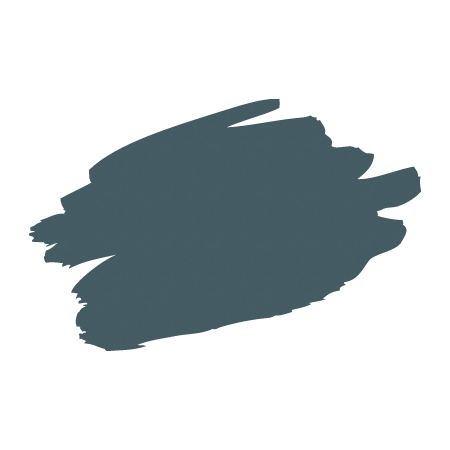
Newburg Green HC-158 - Benjamin Moore
From the Benjamin Moore Website: This color is part of the Historic Color collection. A collection of 191 time-honored hues comprises our most popular palette. Steeped in tradition, the refined, elegant colors of the Historical Collection deliver timeless color that can be used in traditional as well as contemporary spaces. Unveiled in 1976 to celebrate the US bicentennial, a collection of 191 colors inspired by America's historic landmarks.
.png?w=851)
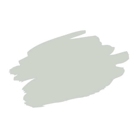
Sea Salt SW 6204 - Sherwin Williams
From The Color Concierge Website: Sea Salt is an iconic blue-green paint color that is soft and muted. it is a flexible color that can look good with both muted and fresh color palettes.
.png?w=851)
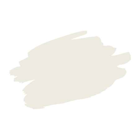
Alabaster SW 7008 - Sherwin Williams
From Jenna Kate at Home: Alabaster is a lovely soft, creamy white. It verges almost on the territory of being off-white, but is just light enough to still be considered white.
.png?w=851)
Whiskers PPG1025-3 - PPG
From the PPG Website: Whiskers is a soft, gray, sepia greige with an umber undertone. It is a perfect paint color for a foyer. Pair it with deeper tones and lighter greiges alike.
.png?w=851)
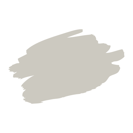
Repose Gray SW 7015 - Sherwin Williams
From Jenna Kate at Home: Repose Gray is the perfect warm gray neutral paint color for every room in your home. With slight green and taupe undertones, it looks gray without ever feeling cold.
.png?w=851)
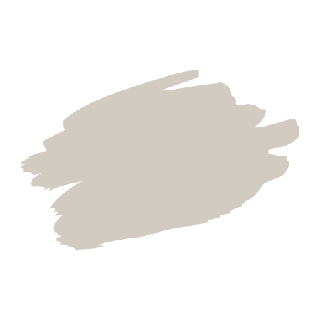
Agreeable Gray SW 7029 - Sherwin Williams
From West Magnolia Charm: Agreeable Gray is a soft warm gray paint color. It is an amazing neutral that works well with almost any other color in any space. It's also a crowd-pleaser as its Sherwin Williams number one selling color. ... It's said to be the best greige/ gray paint color out there.
.png?w=851)
Accessible Beige SW 7036 - Sherwin Williams
From Kylie M Interiors: Accessible Beige is a beige with a grayish undertone. It is more soft, subtle, and neutral as it leans a bit to the gray side.
.png?w=851)
Edgecomb Gray HC-173 - Benjamin Moore
From the Benjamin Moore Website: A go-to gray that's timeless with a modern edge, this earthy, organic neutral is soft and stylish, creating a setting that feels distinctly personal.
.png?w=851)
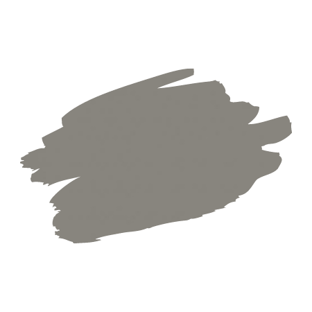
Chelsea Gray HC-168 - Benjamin Moore
From the Benjamin Moore Website: Like a well-dressed gentleman, this gracefully urbane shade of gray adds a sophisticated, scholarly quality to a den or library.
.png?w=851)
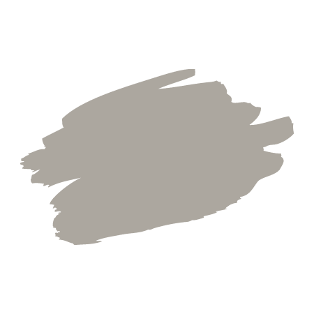
Dorian Gray SW 7017 - Sherwin Williams
From Heathered Nest: Dorian Gray is a warm, neutral gray of medium darkness. It’s a great, neutral choice for those looking for a gray shade with a little bit more body than a light gray.
.png?w=851)
Looking for more helpful tips?
Check out our Blog for more ideas to inspire you!




.jpg?w=128&h=128)